

 SkillClick
How Acrylic Signage Board Design Creates Clear and Modern Business Displays
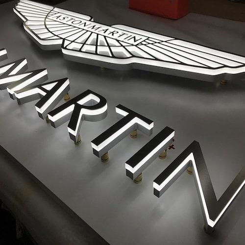
A well-designed sign helps people recognise a business, understand its identity, and find the right location. Acrylic signage board design offers a flexible way to achieve this through clean surfaces, different colours, raised lettering, and custom shapes. Acrylic is used in offices, retail stores, restaurants, reception areas, clinics, and commercial buildings because it can be adapted to different interior and exterior applications. However, an effective sign depends on more than its appearance. Material thickness, colour contrast, lettering, lighting, placement, and installation all influence how well the finished display performs.
1. Why Acrylic Signage Board Design Is Popular
Acrylic has become a common material for business signs because it combines a smooth appearance with practical design flexibility. It can be cut into letters, logos, symbols, and panels of different sizes. Its surface can also support printed graphics, vinyl lettering, and layered elements.
Acrylic signage board design is particularly useful when a business wants a clean and organised display without using a heavy metal structure. For example, a company may install a clear acrylic panel with its logo behind the reception desk, while a retail shop may use coloured raised letters above its entrance.
Another reason for its popularity is the range of available finishes. Transparent, frosted, glossy, matte, and coloured acrylic can create different visual effects. These options allow designers to match the sign with the building's interior, brand colours, and surrounding materials.
Acrylic is also relatively lightweight compared with many metal alternatives. This can make handling and installation easier, although the correct thickness and fixing method still depend on the dimensions and location of the sign.
2. Different Types of Acrylic Sign Boards
Acrylic signs are available in several styles. Each type offers different benefits, so the selection should be based on the message, viewing distance, and installation environment.
Flat acrylic panels
Flat panels are among the simplest designs. They provide a smooth surface for displaying a business name, logo, directions, or other information.
These signs are often used in offices, clinics, schools, shops, and reception areas. A small business, for example, may place a rectangular acrylic panel beside its entrance to show its name and operating hours.
Flat panels can be printed directly or decorated with vinyl graphics. Their simple construction makes them suitable for designs that need to communicate information clearly.
Raised acrylic lettering
Raised lettering uses individually cut characters mounted onto a wall or backing panel. The letters create physical depth and can produce natural shadows under normal lighting.
This style is common behind reception desks and on commercial walls. A company logo made from raised acrylic letters can create a more defined appearance than a flat printed graphic.
Different thicknesses can be used depending on the required depth and the size of the lettering.
Layered acrylic signs
Layered signs combine two or more acrylic components to create depth, colour variation, or a more detailed design. A logo may have a coloured base layer with raised letters attached to the front.
This method is useful when a business wants to reproduce a symbol or design with several visual elements. The layers should be aligned carefully to avoid uneven edges or visible gaps.
Clear and frosted acrylic signs
Clear acrylic provides a transparent appearance and can be used with printed or mounted graphics. Frosted acrylic creates a softer, translucent finish that reduces direct visibility through the panel.
Frosted designs are useful on glass partitions, office doors, and privacy screens. They can display room names, company logos, or decorative patterns while allowing some light to pass through.
3. Choosing the Right Acrylic Thickness and Finish
The thickness of an acrylic panel affects its rigidity, weight, appearance, and suitability for different applications. A small indoor room label may only need a thin sheet, while a larger display may require thicker material or additional support.
The panel should not be selected based on appearance alone. Its dimensions, mounting method, and exposure to impact should also be considered.
Understanding common finishes
Different finishes can change how a sign looks under natural and artificial light.
-
Gloss finish: Creates a smooth, reflective surface that can make colours appear brighter.
-
Matte finish: Reduces reflections and provides a more understated appearance.
-
Transparent finish: Allows the background to remain visible through the acrylic.
-
Frosted finish: Produces a translucent effect often used for privacy and decorative applications.
-
Coloured finish: Provides a solid background or lettering colour without requiring the entire design to be printed.
For example, a reception area with strong overhead lighting may benefit from a matte finish because it can reduce unwanted reflections. A retail display may use glossy acrylic when a brighter appearance is preferred.
Consider the installation surface
Acrylic signs can be mounted on walls, glass, wooden panels, and other suitable surfaces. The fixing method should match the weight and dimensions of the sign.
Small panels may use suitable adhesive systems or mechanical fixings. Larger signs may need spacers, brackets, or a supporting structure. The wall condition should be checked before installation to avoid loose fittings or damage.
4. Designing Acrylic Signs for Better Readability
A sign can look attractive but still fail if people cannot read its message easily. Clear communication should remain the main priority, especially when the sign is used for identification or directions.
Select suitable fonts
Simple fonts are generally easier to read than highly decorative styles. This is especially important for signs viewed from a distance or used in busy locations.
A business logo may contain a distinctive typeface, but supporting information such as room names, opening hours, and directions should use clear lettering.
Choose the correct letter size
Letter size should reflect the distance from which people will view the sign. A small nameplate beside an office door requires different dimensions from a large shopfront display.
For example, a reception sign may be viewed from several metres away, so the company name needs enough height and spacing to remain clear. A small label mounted beside a meeting-room door can use smaller text because visitors will approach it closely.
Use colour contrast
The lettering should stand out from the background. Dark text on a light panel or light text on a dark panel often provides good contrast.
Using similar shades for both the text and background can make information difficult to recognise. Colour combinations should also be checked under the lighting conditions of the actual location.
Keep the layout organised
A sign should not contain more information than its purpose requires. The main message should receive the most attention, while secondary details should remain smaller.
A clinic entrance sign, for example, may display the clinic name prominently, with department information and contact details arranged underneath. A crowded layout can make visitors spend more time searching for the information they need.
5. Where Acrylic Signage Is Commonly Used
Acrylic signs can be adapted to many environments because they are available in different shapes, sizes, and finishes.
Office reception areas
Reception walls are common locations for acrylic lettering and logo displays. Raised letters can create a clear focal point behind the front desk, helping visitors identify the company.
A professional services office may use clear acrylic with a contrasting backing panel, while a creative agency may choose coloured layers to reflect its interior style.
Retail shops and showrooms
Retail businesses use acrylic signs for shop names, product displays, promotional messages, and directional information.
A showroom may install a large logo panel near the entrance and smaller acrylic signs beside product sections. Consistent colours and lettering help visitors understand the layout.
Restaurants and cafés
Restaurants often use acrylic for menu displays, wall lettering, table information, and entrance signs. The material can support printed graphics and decorative shapes.
Signs in food-service areas should be easy to clean. The selected finish and cleaning products should be suitable for the environment.
Clinics and educational buildings
Clinics use acrylic signs to identify departments, consultation rooms, reception desks, and waiting areas. Schools and training centres may use them for classroom labels, office identification, and building directories.
In these environments, readability and consistent placement are especially important because visitors may be unfamiliar with the building.
6. Printing and Fabrication Methods
The appearance of an acrylic sign depends partly on how its graphics and lettering are produced. Different production methods suit different designs.
UV printing
UV printing applies ink directly to a suitable surface and cures it using ultraviolet light. It can reproduce detailed graphics, logos, text, and multiple colours.
This method is useful when the design includes gradients, photographs, or fine details that would be difficult to create using separate cut lettering.
Vinyl application
Vinyl graphics are cut from coloured adhesive film and applied to the acrylic surface. This method works well for simple logos, lettering, symbols, and colour blocks.
The surface should be clean and properly prepared before application. Accurate positioning helps prevent bubbles, uneven edges, and misaligned graphics.
Laser cutting and CNC cutting
Laser cutting can produce detailed shapes and lettering from suitable acrylic sheets. CNC cutting is useful for larger components and designs that require controlled cutting paths.
The selected process depends on the material thickness, design complexity, and required edge finish.
Layering and assembly
Some signs require multiple pieces to be joined together. These may include a base panel, raised letters, decorative elements, and mounting spacers.
Before assembly, each component should be checked for accurate dimensions and alignment. This is particularly important for logos with several colours or small details.
7. Lighting Options for Acrylic Signs
Lighting can change the appearance and visibility of acrylic displays. It is often used when a sign needs to remain noticeable in the evening or in areas with limited natural light.
Front-lit acrylic signs
Front-lit signs use lighting that illuminates the front surface or visible face of the display. They are suitable for some retail and commercial applications where the message needs to remain visible after dark.
The brightness should be appropriate for the surroundings. Excessive illumination can create glare and make the sign uncomfortable to view.
Backlit acrylic panels
Backlit signs use light sources positioned behind a translucent acrylic surface. The light passes through the panel, creating an illuminated display.
This approach is often used for reception features, menu panels, and commercial information signs. The acrylic needs to have suitable light-transmitting properties to produce an even result.
Edge-lit acrylic
Edge-lit signs use lighting directed into the edges of a clear acrylic panel. Engraved or etched details can scatter the light, making the design appear illuminated.
This style can work well for smaller displays, desk signs, and decorative office panels.
8. Signage Printing Dubai: What Businesses Should Consider
Businesses researching signage printing dubai options may find different production methods, materials, and finishing services available. Comparing them requires more than looking at the appearance of sample signs.
The intended use should guide the specification. An indoor reception display may prioritise finish and appearance, while an exterior panel needs suitable material quality, secure mounting, and resistance to environmental exposure.
Before approving production, businesses should check:
-
The acrylic type, thickness, and finish.
-
The final dimensions and mounting position.
-
The spelling and accuracy of all text.
-
The quality and resolution of the supplied artwork.
-
The printing or vinyl application method.
-
Whether installation materials are included.
-
Cleaning and maintenance requirements.
A design proof should be reviewed at the intended size where possible. Small details that appear clear on a computer screen may become difficult to read when printed on a compact panel.
When comparing production examples, businesses may review work from suppliers such as Zahrat Al Madina Printing alongside other providers to understand the range of acrylic materials, printing methods, and finishing options available.
9. Common Design and Installation Mistakes
Several problems can reduce the effectiveness of an acrylic sign, even when the material itself is suitable.
Using low contrast: When the text and background have similar colours, the message becomes difficult to read. Contrast should be checked before production.
Choosing unsuitable thickness: A panel that is too thin for its dimensions may flex or require additional support. Thickness should be selected according to the sign's size and mounting conditions.
Overloading the design: Too many colours, fonts, and messages can make the sign confusing. Keeping the main information prominent usually creates a better result.
Ignoring reflections: Glossy acrylic may reflect lights and windows. The location should be considered when selecting the surface finish.
Poor mounting: Incorrect adhesive or unsuitable fixings can cause a panel to loosen or fall. Installation methods should match the surface and weight of the sign.
Skipping artwork checks: Incorrect spelling, logo proportions, or colour details can affect the finished result. All artwork should be approved before cutting or printing begins.
10. Cleaning and Maintaining Acrylic Signs
Acrylic signs can maintain their appearance for a long time when they are handled and cleaned correctly. Dust and fingerprints are common on indoor displays, while exterior panels may collect dirt and environmental deposits.
A soft microfibre cloth and a cleaning solution suitable for acrylic are generally safer than abrasive materials. Rough sponges, strong solvents, and unsuitable chemicals may scratch or damage the surface.
For signs with vinyl graphics or printed details, cleaning should be gentle to avoid lifting the edges or damaging the image. Mounting points should also be checked periodically, particularly on larger panels.
If a sign is installed outdoors, its condition should be reviewed more frequently. Sunlight, heat, dust, and moisture can affect some finishes and graphics over time.
Conclusion
Acrylic signage offers businesses a flexible way to display names, logos, directions, and other important information. Its range of colours, finishes, thicknesses, and fabrication methods makes it suitable for reception areas, retail shops, restaurants, clinics, and commercial buildings.
An effective design depends on more than choosing an attractive panel. Readable lettering, suitable contrast, accurate dimensions, appropriate printing, and secure installation all contribute to a useful sign. By matching the material and design to the location, businesses can create acrylic displays that communicate clearly and maintain their appearance with proper care.
- Managerial Effectiveness!
- Future and Predictions
- Motivatinal / Inspiring
- Fitness and Wellness
- Medical & Health
- Manufacturing
- Educação
- Real-Estate
- Food Industry
- Hospitality
- Online Games
- Sports
- Home Services
- Civil Engineering
- Safety and Protection
- Software Products & Services
- Fashion and Jewellery
- Artificial Intelligence
- Entrepreneurship
- Mentoring & Guidance
- Marketing
- Networking
- HR & Recruiting
- Literature
- Shopping
- Career Management & Advancement