

 SkillClick
Why Dashboard Design Deserves Its Own Discipline (Not Just "UI Work")
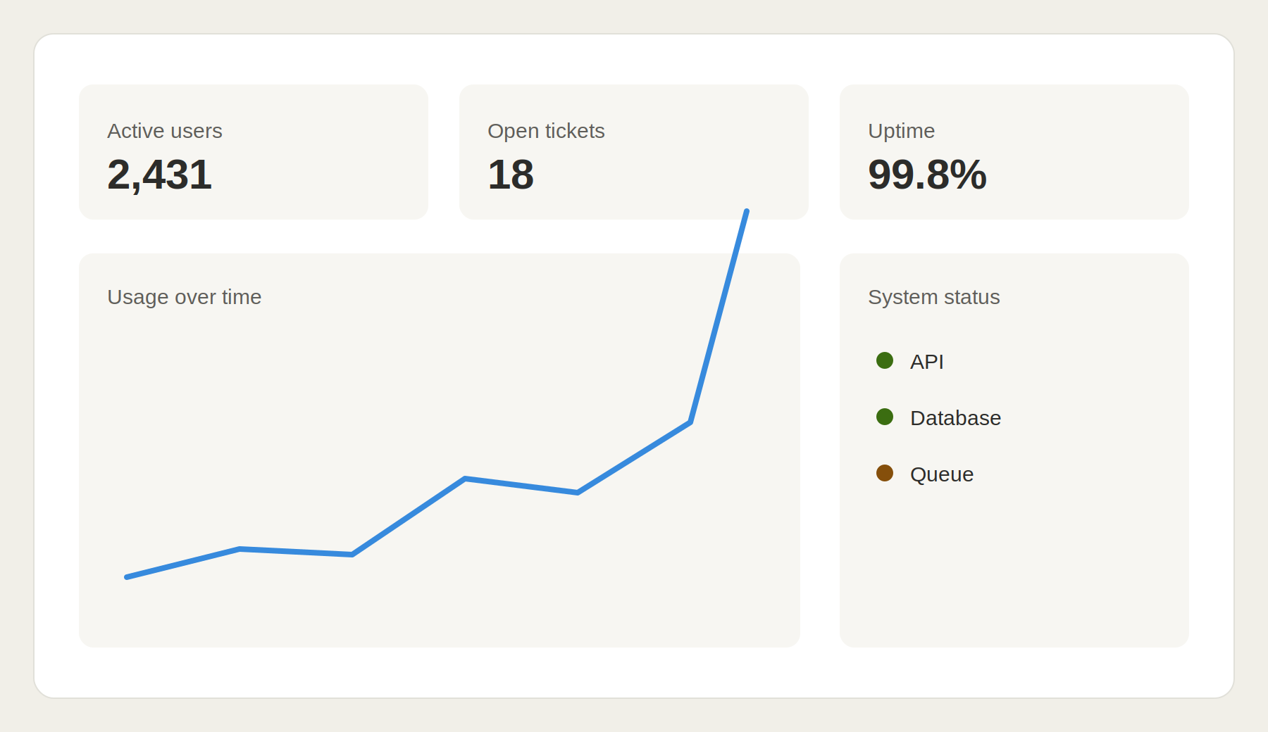
Most teams treat dashboard design as an extension of general UI work. Same designer, same process, same timeline as a marketing page. That's usually where things go wrong.
A homepage needs to persuade someone in seconds. A dashboard needs to serve the same user, daily, sometimes for hours at a stretch. Those are fundamentally different design problems, and treating them the same is why so many internal tools and SaaS products end up cluttered, confusing, or quietly abandoned by the people who were supposed to rely on them.
What Makes Dashboard Design Different
A few things separate good dashboard design from a generic interface:
- Information hierarchy over visual polish users need to find what matters in seconds, not admire the layout
- State design loading, empty, error, and edge-case states matter as much as the "happy path" screen everyone designs first
- Data density decisions how much to show at once without overwhelming the user is a constant balancing act
- Role-based views admins, managers, and end users often need the same data structured completely differently
- Scalability a dashboard that works with 20 data points often breaks down at 200 if the structure wasn't planned for growth
The Cost of Getting It Wrong
A poorly designed dashboard doesn't just look bad, it actively costs the business. Support tickets pile up because users can't find basic information. Adoption drops because logging in feels like work. Teams build workarounds in spreadsheets because the tool that was supposed to replace the spreadsheet became just as confusing.
This is especially common in B2B and SaaS products, where the dashboard isn't a nice-to-have, it's the core product experience users interact with every single day.
What Proper Dashboard Design Actually Involves
professional dashboard design starts before any visuals get touched. It means understanding what decisions users need to make, what data actually drives those decisions, and structuring the interface around that, not around what data happens to be available.
From there, it's about building a system, not a one-off screen. Reusable components, consistent states, clear visual hierarchy that scales as the product grows and the data gets more complex.
Bottom Line
If your product lives inside a dashboard, that dashboard is your product experience, full stop. Treating its design as an afterthought is one of the most common and most costly mistakes teams make when building SaaS tools, internal platforms, or analytics products.
- Managerial Effectiveness!
- Future and Predictions
- Motivatinal / Inspiring
- Fitness and Wellness
- Medical & Health
- Manufacturing
- Education
- Real-Estate
- Food Industry
- Hospitality
- Online Games
- Sports
- Home Services
- Civil Engineering
- Safety and Protection
- Software Products & Services
- Fashion and Jewellery
- Artificial Intelligence
- Entrepreneurship
- Mentoring & Guidance
- Marketing
- Networking
- HR & Recruiting
- Literature
- Shopping
- Career Management & Advancement