

 SkillClick
90s Cereal Boxes: 25 Designs That Defined Breakfast
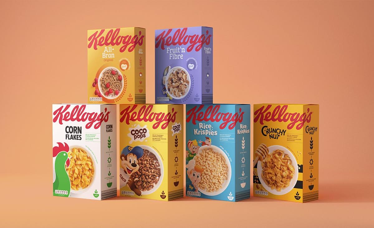
The 90's Cereal Boxes era was loud, colorful, playful, and impossible to ignore. Cereal packaging during the decade rarely tried to look minimal. Instead, boxes competed for attention with cartoon mascots, oversized logos, bright colors, games, prizes, and cereal pieces flying across the front panel.
For many Americans, cereals from the 90s are tied closely to childhood memories. The box was not simply a container sitting on the breakfast table. Kids read the back panels, completed puzzles, searched for prizes, and remembered the characters long after breakfast was finished.
That is why vintage cereal boxes, old cereal boxes, and retro packaging continue to attract collectors and inspire modern designers. The visual language of the decade can still work today when it is used carefully rather than copied without purpose.
What Made 90s Cereal Boxes So Memorable?
Packaging in the 1990s often followed one basic principle: get noticed immediately.
Bright primary colors, illustrated mascots, thick lettering, explosive shapes, stars, swirls, and exaggerated cereal photography filled the front of many boxes. Packaging was especially energetic when the product targeted children.
Breakfast cereal has a much longer history than the 1990s, but packaged ready-to-eat cereal became strongly associated with branding, characters, advertising, and family breakfast culture. For additional background, see the Wikipedia overview of breakfast cereal.
Several recognizable 90s cereals also appeared during the decade. Rice Krispies Treats cereal launched in 1993, while French Toast Crunch arrived in 1995, showing how brands experimented with familiar snack and breakfast flavors.
25 90s Cereal Box Designs to Inspire Packaging
Modern brands creating nostalgic cereal boxes can borrow individual ideas from 1990s packaging without making the design feel outdated.
1. Cartoon Mascot Boxes
Put a large illustrated character near the center or side of the front panel. Expressions should be easy to recognize from a distance.
2. Exploding Cereal Graphics
Show cereal pieces appearing to burst from the bowl. Motion lines and scattered pieces add energy.
3. Neon Color Designs
Bright pink, lime green, orange, blue, and purple immediately create a strong retro impression.
4. Oversized Bubble Typography
Large rounded letters can recreate the playful style commonly associated with children's packaging from the era.
5. Checkerboard Backgrounds
Black-and-white or colorful checker patterns give packaging an instant retro feel.
6. Comic Book Boxes
Use speech bubbles, illustrated action scenes, bold outlines, and comic-style sound effects.
7. Arcade-Inspired Packaging
Pixel graphics, game screens, score counters, and digital typography work well for an early gaming aesthetic.
8. Space-Themed Boxes
Stars, planets, rockets, aliens, and galaxy backgrounds fit naturally with colorful cereal products.

9. Saturday Morning Cartoon Designs
Create original illustrated characters and scenes that resemble the energetic cartoon culture of the decade.
10. Graffiti-Inspired Boxes
Large lettering, paint splashes, geometric marks, and street-art influences can produce a more rebellious look.
11. Fruit Explosion Packaging
Fruit-flavored cereals can surround the bowl with oversized strawberries, oranges, grapes, or other flavor cues.
12. Monster Character Boxes
Friendly monsters work especially well for chocolate, marshmallow, or Halloween-themed cereal packaging.
13. Sports-Themed Cereal Boxes
Basketball, baseball, football, skateboarding, and other sports can help create an active 90s theme.
14. Prize-Focused Designs
Add a clearly separated area that highlights a collectible, activity, or promotional item associated with the product.
15. Maze Back Panels
One reason old cereal boxes remain memorable is that packaging often gave children something to do after turning the box around.
16. Puzzle Boxes
Word searches, matching games, riddles, and visual challenges can turn empty packaging space into entertainment.
17. Collectible Character Series
Create several box variations featuring different characters. This encourages customers to notice multiple designs on the shelf.
18. Rainbow Typography
Multi-colored letters create a cheerful design without requiring complicated illustrations.
19. Geometric Pattern Boxes
Triangles, circles, zigzags, grids, and abstract shapes can recreate the visual energy associated with early 1990s graphics.
20. Slime-Inspired Graphics
Dripping shapes and exaggerated goo effects are useful for unusual flavors or character-driven cereal brands.
21. TV-Inspired Layouts
Design the front panel around an old CRT television frame with cereal characters appearing on the screen.
22. Radical Skate Graphics
Skateboards, ramps, sunglasses, lightning bolts, and dynamic typography can create a classic youth-oriented retro look.
23. Character Adventure Boxes
Instead of showing a mascot standing still, place the character inside a small illustrated story.
24. Simple Retro Reissues
Not every nostalgic box needs dozens of graphics. Recreating an older layout with slightly cleaner typography can make the packaging easier to use today.
25. Limited-Edition Throwback Boxes
Brands can create seasonal retro cereal packaging that borrows colors, layouts, typography, and illustrated elements from classic 90s cereal box designs.
How to Make Good 90s Cereal Box Designs?
A successful retro design needs more than random bright colors. Good cereal box design should still make the product name, flavor, cereal appearance, and important product details easy to find.
Start with a clear visual hierarchy. The brand or cereal name should usually receive the greatest attention, followed by the mascot, product image, flavor, and supporting information.
Use two or three dominant colors instead of making every part of the box compete for attention. Bright colors work particularly well when one darker or lighter shade provides contrast.
Typography also matters. A large retro-style font can create the 90s look, but smaller nutritional and product information should remain highly readable.
Useful Elements for a Strong Retro Design
- One recognizable mascot or hero graphic
- Large cereal or product name
- Clear bowl or cereal-piece photography
- Two to four coordinated colors
- Strong contrast between text and background
- Retro patterns used as supporting graphics
- Games or activities on the rear panel
- Different artwork for side and back panels
- Consistent illustration style
- Enough empty space around important information
These principles allow designers to reference 90s cereals without creating packaging that feels cluttered.
Mistakes to Avoid When Designing Nostalgic Cereal Boxes
The biggest mistake is assuming that a 90s design needs every possible retro element.
Using neon colors, checkerboards, mascots, lightning bolts, graffiti lettering, gradients, cereal photography, and geometric patterns on the same front panel can quickly make the packaging difficult to understand.
Avoid copying original vintage cereal boxes too closely as well. Inspiration from an era is different from recreating copyrighted characters, logos, or artwork. An original mascot and visual identity provide a safer and more recognizable direction for a modern brand.
Another problem is poor typography. Decorative fonts should never make the cereal name or flavor difficult to read.
Designers should also avoid:
- Using too many competing fonts
- Making every text element oversized
- Hiding the product image behind illustrations
- Choosing colors with weak contrast
- Filling every available inch with graphics
- Using pixelated retro artwork
- Making nutritional information difficult to locate
- Copying another cereal brand's mascot
- Mixing unrelated 80s, 90s, and modern styles
- Sacrificing readability purely for nostalgia
Also read Things to Do in Belize: Complete Guide Who Love the Outdoors
Modern Packaging With a 90s Feel
Modern 90s cereal box designs do not need to look exactly like packaging produced thirty years ago. The strongest approach is to combine recognizable retro elements with today's cleaner layouts and printing capabilities.
A modern cereal brand might use a cartoon mascot, thick outlined lettering, colorful cereal pieces, and a geometric background while keeping secondary information organized and easy to scan.
This approach creates the emotional appeal of nostalgic cereal boxes without making the package appear outdated.
Why 90s Cereal Boxes Still Influence Packaging
People remember packaging that created an experience. Many cereals from the 90s were supported by recognizable mascots, television advertising, promotions, games, unusual flavors, and collectible elements. Wikipedia's overview also notes the long use of cartoon mascots and prizes in children's cereal marketing.
That interactive approach explains part of the continuing interest in collectible cereal boxes, cereal box art, and classic breakfast packaging.
For designers, the most valuable lesson from 90s Cereal Boxes is not simply to make everything brighter. It is to give packaging personality. Strong characters, recognizable colors, readable typography, playful graphics, and interactive panels can turn an ordinary cereal package into something customers remember long after breakfast.
- Managerial Effectiveness!
- Future and Predictions
- Motivatinal / Inspiring
- Fitness and Wellness
- Medical & Health
- Manufacturing
- Education
- Real-Estate
- Food Industry
- Hospitality
- Online Games
- Sports
- Home Services
- Civil Engineering
- Safety and Protection
- Software Products & Services
- Fashion and Jewellery
- Artificial Intelligence
- Entrepreneurship
- Mentoring & Guidance
- Marketing
- Networking
- HR & Recruiting
- Literature
- Shopping
- Career Management & Advancement